-
Posts
2,323 -
Joined
-
Last visited
-
Days Won
6
Everything posted by thedom
-
I started this project with the photo of a french window I found on the website of a window manufacturer a few weeks ago (I believe on this site). I did not know exactly what I wanted to do with it but I thought that this could used as a nice basis for a future project. The project was built over an afternoon without any preconceived idea, intuitively and without knowing what I wanted to achieve exactly. I added the elements according to my inspiration. First the doors (found here) then the frames (found there). The "architecture" of the coffee table is the one of my own coffee table. I took photography of the casters. The travelling was achieved at the end. There are still little blows that I would try to soften and some little display bugs I want to fix too. I ended up with this little sequence. The goal is not to present the photos hanging on the walls but to be an introductory sequence to a photo album. What do you think ?
-
In my opinion, main title (« work in progress ») is perfect but subtitle should be « Constructive feedback and help wanted ».
-
I could restore my transitions and styles - thanks to Igor! - and finally install this "mega pack". Some of the transitions are very nice. What software did you use to create the video masks you use for each transition. After effects ? Thanks Paul.
-
Great, glad to be loyal to your proposal
-
Hi Mary, Thank you for your interest in this new project. You raise a point that has been very difficult for me to make. I wanted the style to be able to display two pages (left and right) with landscape and portrait pictures in a 16:9 format screen, with size of pictures optimized to its maximum. More and more smartphones takes (good) photos in 16:9. I took this in consideration. Pictures format are very different : from 4:3 to 16:9 via 3:2 In this style, landscape pictures are displayed without beeing cropped. And portrait pictures have to be cropped to 8:9 (half of 16:9) because that's the proportion of the leaf I choose. It gives the ability to display 16:9 pictures in "full screen" (on both pages). May be I was wrong but the 8:9 proportion seemed to be the best compromise. If I understand correctly, you would like the leaf to be 3:2 ? If I would choose this format, the photo album would be very wide in order to display right and left pages in the 16:9 screen format, leaving a lot of unused space at top and bottom of the screen. And for portrait pictures, there would be large borders on the side. In this case, the best option might be to display only one page at a time. What do you think ? Anyway, to be honest, I should rebuild my project half from scratch. If there is a lot of requests for this, I would make an other style in the future. But I have good news for you about the background pages. The style already give the option to choose your own background page for EACH picture. Here are examples with black and white pages (with 3:2 pictures) I will release the package with a lot of background pages. But of course, you will have the ability to choose or even create your own background pages with a photo editor (like Photoshop Elements), leaving a very wide place for personnalisation and creativity. It's the same for the cover of the photo album and for the ground. A lot of textures will be included in the package but you will be able to choose your own. This way, for the photo album cover, you can choose your own picture.
-

Apply same animation options to multiple objects.
thedom replied to thedom's topic in Suggestions for Next Versions
Thank you for taking time to answer in details. Actually, there was a misunderstanding on my side I think. I thought you were talking about the ability to apply same front/back display or percentage of opacity to all children of a master object by applying those parameters only to master object. As you certainly know, it is possible but only for blur parameter right now. Yes, what you explain is possible for all parameters of the « Properties » tab. It will apply the parameters to all selected objects. What I would like is the same for all parameters of the « animation » tab. I didn’t know it was already possible for « opacity » parameter. -
Welcome in the community sanpier. Honestly, I am quite sure you will not regret it. And you will even become more and more addictive, thanks to this community too.
-
Here is a personal suggestion. 1. A text of question for this poll. Do you want to create a new section in the forum to post you work in progress and receive constructive reviews/help to finish your project ? 2. Variants of answers. I don't think it's necessary Why not, but I'm not sure I will visit it Yes, I fully support this project ! Why doesn't it exist yet ?! What's PTE AV Studio ? ;-) 3. Suggested name for this new section of the forum. I suggest "Work in progress - reviews/help wanted" In my opinion, it would be not a section for tips (but it's only MY opinion).
-

Apply same animation options to multiple objects.
thedom replied to thedom's topic in Suggestions for Next Versions
I very rarely use blur for master objects because in my experience, this causes display anomalies if you individually change blur parameter of one of the child objects. I prefer to apply blur indivisually to keep full control. I didn't konw for front/back display and for transparency (=opacity?). I tried but didn't succeed to make it work. Can you give me more details please ? Thanks. In my opinion, the suggestion would be particularly useful for "speed animation" parameters too. 85/5000 -
Yes, it would be useful and a nice feature. Right now, I think the only option is to modify the X and Y rotation of the master object. Unless you have something else in mind ? I will leave instructions about how to do it easily for beginners. Thanks Lin.
-
Thank you very much to the 4 of you for your comments, to have feedback really helps to step back and is very usefull. I agree, I will not leave the bouncing for every page. You’re right, I will only keep it for a few pages. Thanks. Paul, I agree. The style will not be linear. I find it a little bit boring too. It is just a demo of the still sequence of turning pages, this is not at all final result. As I mentioned in a previous message, the style will mix different angles and movements of camera. You can watch the idea in the first video I released. I still have a lot of work and testing to conceive what would the best equilibrium between the sequences with different point of views (mix between still and animated). And I will also put in the package individual sequences in order for the end user to compose his own animation with his favorite points of views (like I did with my « flap » style)
-
-
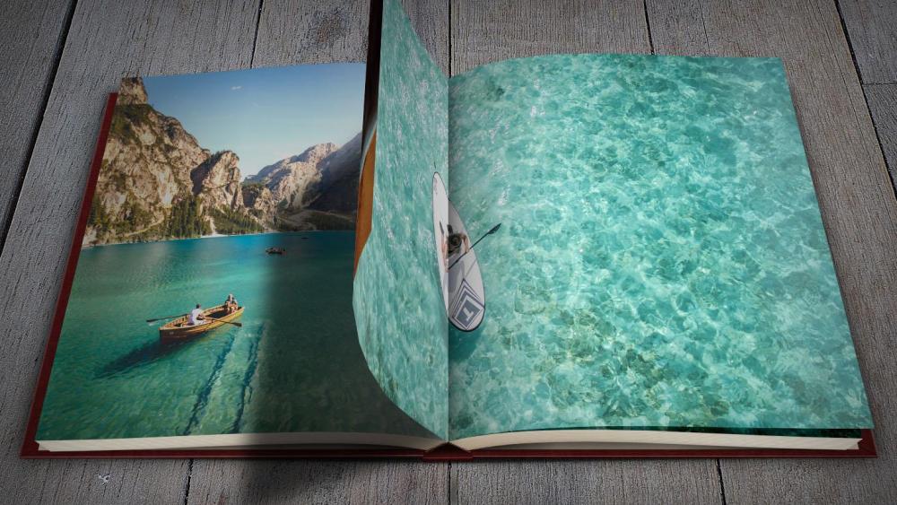
When I watched this demo this morning, I noticed two things I want to fix : - the global shadow on back of left page when page turns is not correctly synchronised, there is something wrong. - th closing of the book at the end is too abrupt. I will start smoothly the change of point of view THEN start to close the book a couple of seconds later. It's at the SAME TIME for the moment and it looks too brutal.
-
You can already apply same "properties" options to multiple objects (example: show only front side) It would be sooo convenient and such a big time saver to be able to apply same "animation" options to multiple objects. Example: - same blur or same brightness to objects - add a key frame with same time to objects!
-
I agree, it would very nice to have a grid like this. and may be a « dynamic » grid that can be applied to a specific object and which adopts automatically the same rotation parameters. I will post a screenshot later.
-
I totally agree, we need this thing !
-
I totally support this idea, it would be very rewarding and instructive for everybody and not only for those who present their work. We learn a lot from each other.
-
Here is the first complete demo. It’s a very classic presentation. The complete photo album package of styles will include also more dynamic sequences. Other demos of this concept very soon... The photo album will give you the ability to present as many pictures as you need. Do not hesitate to leave me feedback please. Thanks.
-
Hi, I have a big issue after importing this pack. All my own transitions and styles have disappeared, it only remains the standard ones (and none of this pack). I checked in ...\Documents\PicturesToExe\Styles and Transitions and all files are still here. They just don't appear in the PTE windows. What can I do yo restore them please ? Thanks. PS : Yes, I have version 10.0.10 (64 bits) Build 6
-
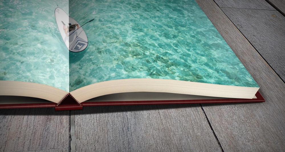
Thank you for keeping your interest in my project Aleina. I spent a lot of time watching my photo albums under different angles today ! And here are some new screenshots of my observations on my project. It's almost not noticeable, it's little details, may be you can't even notice them but actually it helps to increase realism. I think I am almost finished with the light and shadows. I finished the closing sequence too. Each sequence I have designed can now be linked one to each other without any visual clipping problem. I still have to conceive different smooth "camera" movements for each sequence. I hope I will be able to release a first demo of the whole project tomorrow night...
-
I totally agree, I would like such a new section too
-
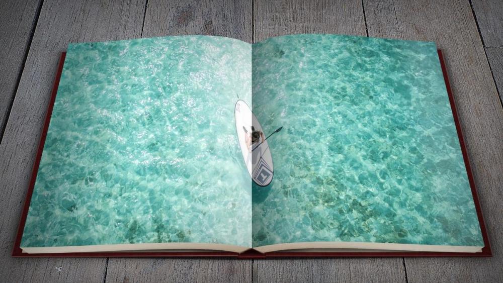
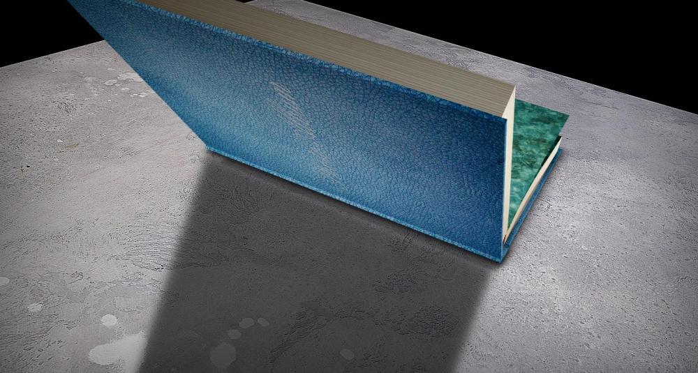
Nelson, Judy, thank you very much, it's a huge compliment. I fixed visual issues and added some details on the cover (mainly lights and shadows). I think this part is finished. Here are 4 images used and the result after style is applied. Just for fun, please post you own images (1 to 3 for cover and 2 pictures of the photo album), it would be my pleasure to show you what it will look like after style is applied. Next big challenge for me is to mix the sequences (photo album opening and pages turning) and avoid glitch and visual issues...
-
Thank you for your compliments and your enthusiasm. I’m investing a lot of time and effort into this project. And it seems to be worth it. Yes Paul, you're right, the visual anomaly will be corrected (and other issues less visible). Thank you very much Aleina, I am really sensitive to your comment. I'm trying to have this artistic approach. From my point of view, the technique must always be at the service of the final result. A technically complicated project may not be visually pleasing. Alice, the two videos are complementary. The one on Vimeo concerns the pages that turn. The second one concerns the opening of the photo album. Both sequence will be in the final style (with a sequence of photo album closing I have to create - should be quick if I use the opening sequence). I explained what I intend to offer as a style package (see some messages above).
-
I have an other idea for the leaves. For each of them, instead of a single image, you could cut them in two parts int hte middle (along the rib) and put them together with different orientations to give them more "volume".


