Aleina Show
-
Posts
258 -
Joined
-
Last visited
-
Days Won
27
Everything posted by Aleina Show
-
You turned out very beautifully! The edges of the mask template can be edited. In the "properties" you need to click on the "file" and the editing window will open.

-
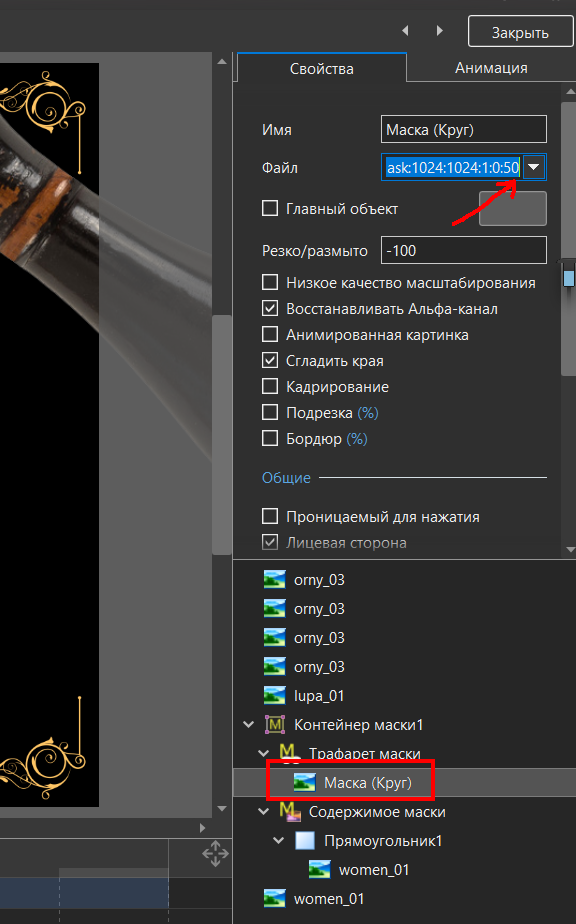
vbl2007, Your mistake is to configure the mask. Mask pattern- circle. You need to set the blur at the edges = 0. And adjust the size of the mask so that it matches the size of the magnifying glass. Everything else you have done is right. I corrected your example. Best regards, Aleina Zoom_lupa_test_modified_Jun21-2020_17-15-15.zip
-
I suggest adding the “disable logo” option in the slide settings. I usually do not use the logo on the opening and closing slides. Such a function would be very useful.
-
I can also tell you a little about this topic. The length of the video depends on the target audience. If you create wedding and similar family films, then there is a reason to make rather long videos. On the Internet there are many philosophical considerations and articles on this topic that I had to study by the nature of my work. It turns out there’s even a term like “torture with a slide show.” And before creating a video, I always think about the target audience so that for them my video does not become torture. Wedding and family films are intended for a narrow circle of people. They will mainly be viewed in a very close family circle. And the audience, most likely, will not be annoyed by a 10-15 minute film. (Although my husband runs away after 5 minutes of watching films with a family vacation) ... And an attempt to show this film to little-known people can be unsuccessful. If you are making a video for posting on social networks, then you need a different approach. I have been working in collaboration with a local scout club for several years. I make reportage videos for them about their activities. Theme of tourism and sports. They often travel in forests and mountains, parachuting. They collect a lot of beautiful video materials. The purpose of creating videos is video reporting and advertising. We started by creating 15 minute clips. Beautiful, with a full report. And we were very surprised why there were absolutely no reposts in the target communities. Then we switched to 3 minute clips. And there were no reposts either. We started talking with the administrators of the target communities, and it turned out that the 3-minute format was too long for them. Then we switched to Instagram format for 1 minute. This is very fast, I often need to place 15-20 video clips in 2-3 seconds + intro. Sometimes I have to increase the speed of video clips by 120-200%. But it’s these videos that adore social networks. Official communities around the country are happy to publish them. First of all, you need to respect the time of the audience. And you also need to consider the age category of viewers. The older generation loves slow shows and long films, and it is very difficult for young people to focus on more than 3-5 minutes. Well, experience shows that video clips lasting 1 minute are ready to watch with pleasure many times. And it does not cause irritation. As an example, I will show a 1-minute video about a trip to Elbrus in early June.
-
Bruno, thank you very much for your generosity! It’s true that the layout of the perfect album can be done for a very, very long time. I wish you not to lose enthusiasm! Already done a very difficult job!
-
Bruno, you are well versed in the technical aspects of the program! Thank you very much for your help! You are very kind! I thank you for your help! I’m very interested to see which way you go in creating the album. Best regards, Aleina
-
thedom, Tonton Bruno Thank you for sharing your experience! For me it is very valuable. Initially, I also proceeded from this position, I think it is easier to do. My task is to make the work as easy as possible for those who will use my project in their work. I would not want them to repeat editing in duplicates. Creating a style helps when changing photos. But this does not help if there is more than one text area. And I have 4 texts + 4 duplicates on each slide. A way to make non-editable images non-clickable for quickly finding the right layers, it works 90%. For example, you have a photograph on one side of the sheet, it is large, stands out when you click the mouse, and on the other side of the sheet is a small text. And it is already impossible to select it with the mouse, since it is in the field of action of the photograph. If the method of doing all the work on one slide also contains duplicates, this enterprise will not make sense. But most likely it will be so. Thank you very much, this is a very interesting way! It’s not very clear to me how such sorting of layers “by depth” works, but I will definitely try it! The main thing is that this is a working method! I am very grateful to you!
-
Bruno, may I ask you a technical question? Is your album in 1 slide? Or is it a few slides? I want to make my album in 1 slide. But now I have constant problems with this. Those sheets that must first be on top (the right side of the album) should overlap (be on the bottom) to the left after turning over. How can this be better organized? Maybe it makes sense to use a mask? But I can’t imagine how. Or duplicate pages, use duplicates, changing their visibility?
-
I am from Russia, this link opens. But in my Cent browser, I see the same error after entering the email. Everything used to work well on this browser before. In the Yandex browser and in Mozilla Firefox everything is fine, the site is working. So maybe this is a browser problem.
-
This «Somebody» has become smarter than us! The search algorithm pushes us to what interests us. And this is good. Probably.
-
Mary, thanks for sharing this video. Such a fire is terrible. It’s good that the firemen were able to quickly cope. Your video is epic. I also agree about the text. It would be nice to make it more readable. Best regards, Aleina
-
sanpier, mhwarner Thanks you! It is very nice to hear! Best regards, Aleina
-
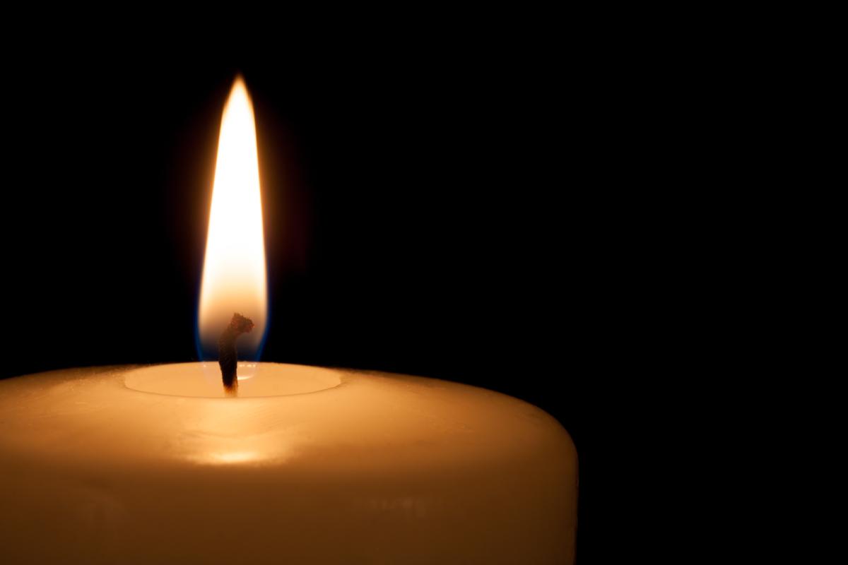
I like the left candle! For greater realism, you can add small indentations, which are obtained under the wick from molten wax.


-
nelson, wideangle, thedom, Roje001 Thank you for your kind words! I came across a tutorial on how to make a similar effect in Adobe After Effects. And since I have recently wondered if it is possible to implement in PTE AV what After Effects can do, I tried to do the same in PTE AV. Only in our program does it work better not as a style, but as a transition.
-
Berny, MUR, Tonton Bruno, stranger2156, henry64200 Thank you so much! Best regards, Aleina
-
Yes, it turned out to be a very useful feature. Welcome! http://aleina-show.ru/
-
It seems to me that the left candle looks more real. I like it! But this is just my opinion.
-
It looks very pretty! The flame of candles looks natural. You can make the dark center (wick) a little more noticeable. This is another beautiful idea!
-
A little experiment. This transition can be downloaded from my website. http://aleina-show.ru/skachat/stili-dlya-pte-av-studio Best regards, Aleina
-
George, Thank you very much for your practical outlook on the job. I will try to answer your questions. Yes, I think that using the same project for 2 years in a row is not the best option. But the same opinion can apply to most finished projects. There are universal styles that we can apply in any project. But they are usually boring for children. But you gave me a good idea to think about. I could create animation sets separately so you can change them in different projects as you wish. As for text layers. Initially, the project was planned as a metric in which it was possible to fix the most important features of the child. What he loves or does not love, what he knows how to do. He waves his hand on "goodbye," slams the closet doors, etc. Some details of his grandparents may not know. What can you ask your child's parents about? I was inspired by graphical examples of metrics on the Internet. And the original work in After Effects. You can look at it, maybe some texts from there will suit you. https://videohive.net/item/family-memories-baby-photo-album/13709995 In addition, you can use decorative letters with pictures instead of letters. For example, such http://ru.legionfonts.com/fonts/atman-dings https://good-surf.ru/forum/index.php?id=1181000 You can use any images instead of text, for example, icons, flowers, hearts, cars. It all depends on your imagination. I tried to make editing this complex project as simple as possible. On Igor’s advice, I made all the layers “non-clickable”, except for those that require editing. And this is text and photo. In most cases, you will only need to click on the screen in the "objects and animations" to select the desired text layers and layers with photos. This way you can easily find text areas. And if any of them seems redundant to you, you can remove them. The project has a small video tutorial on editing the project with English subtitles. Best regards, Aleina
-

"Neon text" within PTE (Stranger Things like)
Aleina Show replied to thedom's topic in General Discussion
That's cool! Thank you, Dom! And I racked my brain how to make transparent text with a stroke. Best regards, Aleina/ -
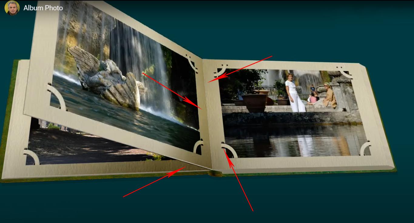
This is a very beautiful album. Excellent made flipping effect and page thickness. Bravo! I have a small suggestion to add some shadows. I think that with shadows your album will become more realistic. I added some shadows to Photoshop and showed where. In the middle of the book. Under the flipped page. And under the photo mounts. And I think that it would be better to slightly increase the speed of appearance of photos on the last 2 pages. It will be a beautiful style! Best regards, Aleina

-
I liked your option, it turns out realistic, the pages are voluminous, cardboard. And did you manage to make it so that when you turn over the number of pages on the left increases and decreases on the right? I also want to see your result. This is an interesting suggestion, thanks!
-
Yes, I noticed that too. It’s a good option.
-
This is a cool parallax! It looks very pretty! I really like that you are constantly working to improve your styles. Sometimes I think it's already impossible to do it even better, but here you have a new version coming out! And it is even more beautiful!