-
Posts
405 -
Joined
-
Last visited
-
Days Won
1
Everything posted by stranger2156
-
Hi Gary, I think you can find an acceptable solution to your problem. If you tell me the duration of the slide (apparently about one hour or more?) and the approximate visibility intervals of a particular frame in the ZOOM, i can try to record a video with the solution. Paul
-

audio will play from beginning of show!
stranger2156 replied to What A Ride's topic in General Discussion
Sound in unnecessary audio tracks can be quickly blocked on the timeline (Ctrl + M). Paul -
A great start to showcase your albums (reducing time a bit due to speed). Paul
-
-

Apply same animation options to multiple objects.
stranger2156 replied to thedom's topic in Suggestions for Next Versions
This is so ... I would like to see the same opportunity for transparency and correction filters. It seems to me that all other animation parameters in the child objects are directly dependent on the parent, although they do not take their values. This applies to motion parameters. And such a connection / dependence seems to me optimal. P.S. Developers, apparently, will have to turn off the change in transparency and correction filters in key frames, in the case when they are preinstalled globally in the parent object for all content. Such an approach would suit me perfectly. It is flexible enough and is currently implemented for blurring. Then there will be a choice, depending on the need. -
Hi, MUR Now your idea becomes clear to me. Receive constructive comments and suggestions in the process of creating a presentation. Well, such an idea has a right to exist, it is difficult for me to judge how relevant it is to this forum. There is something similar on my forum, but not for constructive criticism, but in the form of an appeal to the community to help or advise in something. When the author is not sure of his abilities to cope with something on his own. Regards Paul
-

Apply same animation options to multiple objects.
stranger2156 replied to thedom's topic in Suggestions for Next Versions
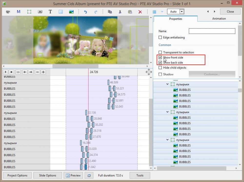
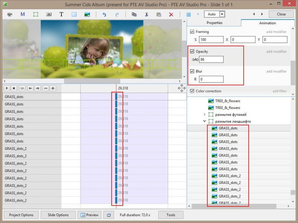
I mentioned blur because you specified it in the examples of the first post. I had a recently interesting case with blurry footage under a mask. There was a need to do 1-2% blur to smooth out the sharp contour of the footage (animals and birds in the Summer Cids Album project). Neither in the mask stencil nor in the contents of the mask did the blur give an acceptable result. Such a result became possible to obtain only in the mask container by setting 2% in the blur parameter, which affected all the contents of the container at the same time. Front / back visibility, as well as transparency for a group of objects, is set as follows. For the visibility of the parties, first select the desired group of objects, go to the properties tab and set the desired visibility. It will change simultaneously for all selected objects. For transparency. The same, first select a group of objects, then the first keyframes in this group and set the desired transparency for the entire group at the same time. -
I don’t understand the very need to create a separate section or something else for constructive comments on user work. But is it that the topics in which each work is presented are not suitable for this? The author presents his work in a separate topic, others look at it and leave constructive comments (if any). What else is needed? I do not catch the point in some additional platform for constructive comments. Indeed, in any case, we will need the subject of discussion for comments ... will we duplicate the topics presented or dump everything into one topic?
-
The same composition / angle when turning pages is too predictable. He cannot keep the viewer's attention for long, everything is too predictable and straightforward. Some changes in the scene are necessary (when turning the pages), as it seems to me. This will create a more lively connection with the viewer. Regards Paul
-

Apply same animation options to multiple objects.
stranger2156 replied to thedom's topic in Suggestions for Next Versions
Blur can be applied now to several objects simultaneously, as well as front / back display or transparency. To have the same opportunity for color correction filters, I think, would be nice too. For example, if I need the same color correction in a dozen objects, it would be enough to activate the color correction filter when selecting all the first key frames in these layers. -
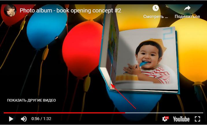
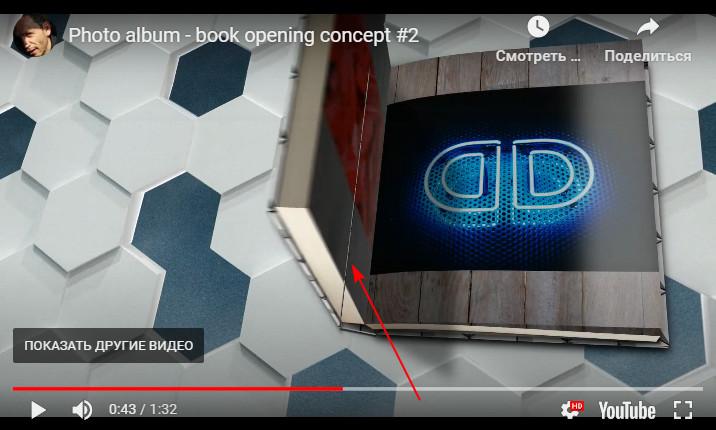
Hi Dom, Your experiments with 3D modeling of the book look fantastic, I especially liked the last two demos (starting at 1:02). Respect! P.S. With a negative value for turning the book along the Y axis, a small strip is noticeable. Knowing your pedantry, I think you will want to fix it. Paul
-
Hi Aleina, as one of the options is quite acceptable. But on light surfaces, the reflection effect is "lost". In my opinion, dark surfaces give more realistic volumetric effects when the image is expanded. Best regards, Paul
-
Hi, the program does not need additional tools or functions to create similar effects, everything you need is available on the O&A tab. Using masks and suitable images will help you succeed. Paul
-
Great job, Aleina, I also liked the bounce effect after deploying. Paul
-
Nevertheless, the problem of reflection was solved with the help of a mask.
-
Nice work, Aleina! In addition to adjusting the shadows, as you promise, think about reflections. Above, I asked Dom about this. Using masks in the created design is impossible. Due to the fact that the universality of the effect is lost. It remains only to manipulate the filters on duplicate images. Not the best option (blurry reflections will go beyond the plane, and this will be noticeable on a dark background). But I think an acceptable option is possible. If the Dom does not offer another alternative.)) Paul
-
Hi Dom, I managed to cope with the universality of the effect for any image formats (with your help), but there was a problem with the effects of reflections during spreads. As I understand it, masks are needed for reflections. These masks should be integrated into the U-turn design. The problem is that only the mask can be integrated with the image format corresponding to the project format. As a result, the universality of the effect, with reflections, is again in question. Which way did you realize this? It’s a little strange why the mask stencil does not react in the design in the same way as image objects? Paul
-
I'll postpone it for dessert ...)))
-
Dom, I did it, thanks for the tip! My concept was different from yours only in that it used a frame. After using the picture itself as a frame, everything worked in a wonderful way - the effect has become universal for any picture format. It remains to bring to shine and the effect is ready. )) With your help, I made for myself another discovery in the PTE. Best regards, Paul
-
Thanks Dom, I'll try to figure it out. )
-
How to make it universal, for all formats, remains a mystery to me ... I will look for such an opportunity.
-
Yes, I saw your video today and decided to try to repeat this effect.
-
You could not see it before, I created this video only today. ))
-
Great job, Dom! I was always interested in how this or that effect is obtained, especially in the program in which you like to work. Disclosure of the image itself was not particularly difficult, made a couple of options. There is more to think about to improve some of the details. I'm more interested in whether you managed to make this style universal when it can be applied to various photo formats? Or does each format need a different style?
-
Thank you Igor, for the help, everything works fine. Only an addition to your information is required, after the Slide1: Image object (in each row) we add ReplaceWithEffectBuffer = 1. And after the Slide2: Image object you need to add ReplaceWithEffectBuffer = 2 (also in each row). Paul

