-
Posts
587 -
Joined
-
Last visited
-
Days Won
6
Everything posted by Tonton Bruno
-

PTE-AV-Studio 10 - Shadow Play
Tonton Bruno replied to Barry Beckham's topic in Tutorials & Video Lessons
Do you mean you need a différent opacity for the shadow than for the the image itself ? Do you really need such a refinement ? -

PTE-AV-Studio 10 - Shadow Play
Tonton Bruno replied to Barry Beckham's topic in Tutorials & Video Lessons
Hi Lin. I have no doubts that sometimes the "Shadow" button can't do what we want, but the exception is not the rule, and in the present case, this tuto which seems targeted to the beginners is counterproductive. There are so many things wich are complex and diffuicult to do under PTE animations, when something is easy to achieve, why not just hit the right button ? This is why I ask the question to Barry. What is the purpose of this tuto ? May be I missed something. -

PTE-AV-Studio 10 - Shadow Play
Tonton Bruno replied to Barry Beckham's topic in Tutorials & Video Lessons
Hi, May be I missed something but I don't understand the purpose of this Tuto. If I want to drop a shadow around an image, I click the "Shadow" button and I adjust the shadow parameters according to my wishes. What is the problem with the shadow function included in PTE ? -

Cannot Create Backup in ZIP, because of Duplicate File Names
Tonton Bruno replied to jmG-06100's topic in General Discussion
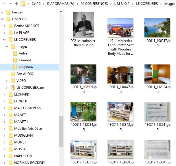
I work this way for 10 years and never met any disaster. When I want to use Pan and Zoom, I just have to change the name of the subfolder, from "Current" to "Original", and everything is OK. Every day, all my files are saved in a separate cabinet using Acronis routines. I have more than 120 projects organized this way. Of course, my true original files (RAW, MOV, WAV...) are on a separate disk. -

Cannot Create Backup in ZIP, because of Duplicate File Names
Tonton Bruno replied to jmG-06100's topic in General Discussion
In my case I often have the same name for different images in different folders, so the solution given by Igor is OK for me, and the one from Denis is not. This case is very frequent for me because I always use 2 folders, one for the images in 1080 height for normal use, and one with the maximum size to be able to zoom inside the image, and very often I make a view with the small size because I want to navigate rapidely with the keyboard between views, and then a view with the maximum size which includes pan and zoom actions. To-day I can't save my project in a zip file, because I have too many files to rename. -
Hi Manuel. This is one of the reasons I dislike the dark interface. The controls are easier to visualize and manipulate on the white background.
-

PDF Tutorials for PTE 10 - AV Studio Pro
Tonton Bruno replied to Ronniebootwest's topic in General Discussion
I make video tutorials in french, and many users ask me also a PDF abstract, because it is faster to go to the point when you remember the solution of your problem is in this tuto but you don't know exactly where. Don't hesitate to write PDF tutorials, Ronnie, they will be vey usefull for many people ! -
Yes I do. It was for a lecture and everything was OK. Thank you Igor, you and your team made a very good job !
-

Photoshop/Lightroom Texture Slider
Tonton Bruno replied to Barry Beckham's topic in Tutorials & Video Lessons
+ 1 -
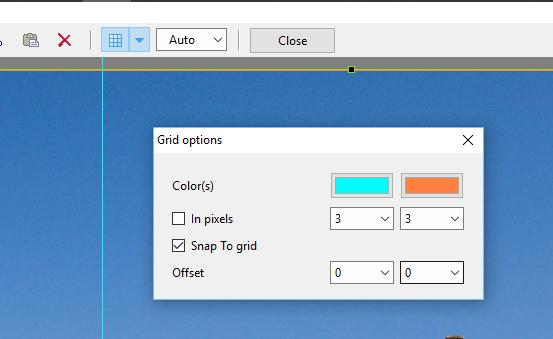
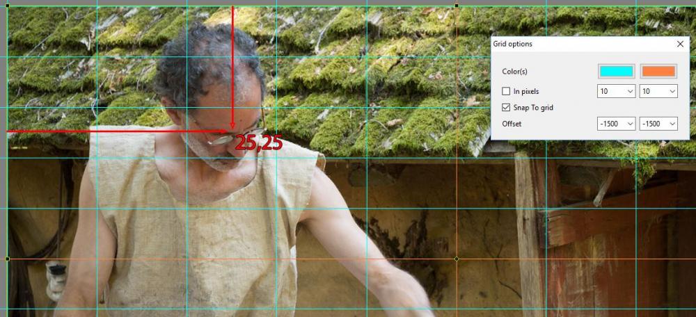
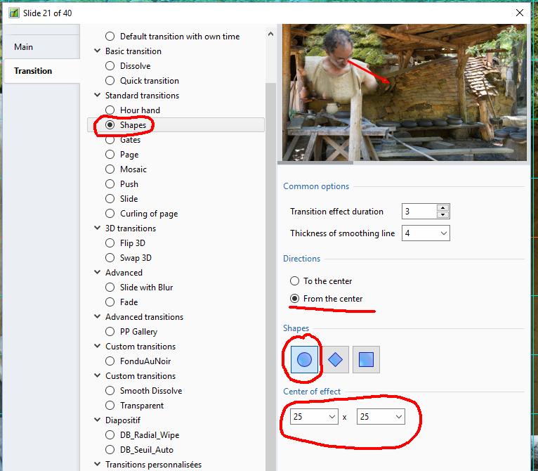
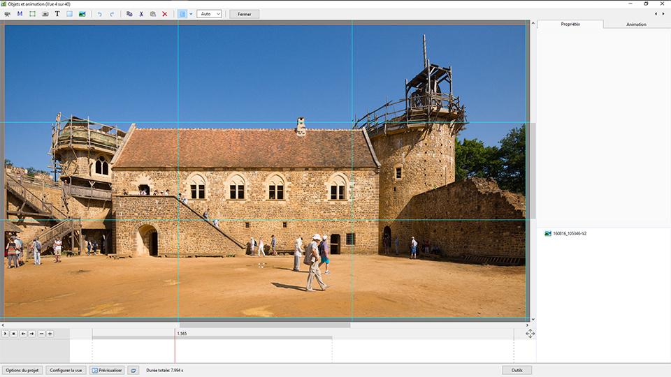
This is the way to configure it. Personaly I prefer to use a grid 10 by 10, with the orange lines crossing at the center of the screen. This is useful to evaluate the position of any subject. If you use the shape transition, you can then give precise coordinates for the center of the effect. And then you obtain a fine result. This way to work was described many years ago by Aginum on Diapositif forum.
-
Hi Barry. You already have the grid in the O&A window. I don't see were you want to put an extra grid, and what will be the purpose. Could you please develop ?
-
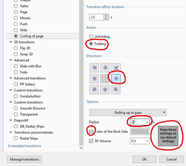
When I select a transition, I have sometimes the feeling that PTE suggest me just the contrary of what I wish! I'm sure it will be thery usefull if we have a way to check a box stating: "Keep these settings as my default settings". I put an image just to illustrate the request and to show you what I have to modify each time I want to use this transition.
-
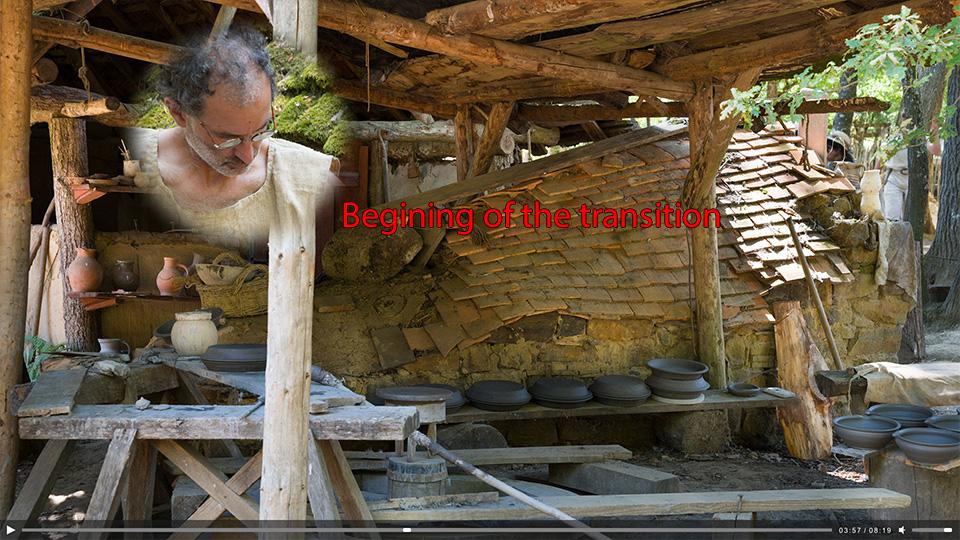
The interest vraries for each spectator, and even for the same spectator the interest varies with days and seasons. This is why you should try to not be longer than 10 minutes. You would have a chance to catch the attention of a maximum of spectators, and it is a kind of respect for the time of each spectator. I consider it is strongly impolite to speak during more than 10 minutes without knowing if what you are saying is realy interesting for the person who is in front of you.
-
For me, as a spectator, a PTE slide show with a good sound track (voice, music and sound effects) with a duration of 5 minutes, it's OK. 10 minutes is too long and I stop the project before the end, or I leave the show-room if I can. If I can't leave my chair, I start to speak with my neibours.
-
This is also the case for the D850 and I apreciate this option.
-
Just drag the video to the PTE sound track, and you get it as a separete sound track. No need for an external conversion.
-
OK. So the request is about an automatic frame adaptation for masks included in a style or a custom transition, according to the screen aspect ratio set in the project. Is it that ?
-
Hi Denis. Do you suggest to modify the proportions of the image ? Not a smart choice for people or monuments...
-
No problem, but your phone is rude ! I read every new tuto from Jesus Ramirez and I learn tons of things about Photoshop, and yes I use maybe 5% of them !
-
Here a link to a tutorial explaining what you can do with Photoshop blending modes.
-
Thank you Dave, great job !
-
Great job ! Congratulations !
-

Include audio track as part of a Slide Style
Tonton Bruno replied to wideangle's topic in Suggestions for Next Versions
Time line scaling and audio track in O&A would be very useful. I'm sure that we all would accept to wait PTE 10 3 months more and get these features. -
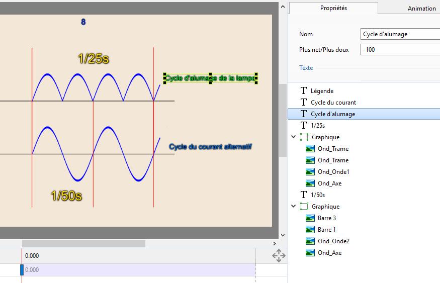
It would be nice to get a text name automatically taking the 15 first characters of the text contents.

